ONE-PRODUCT STORE EXAMPLES
Two real one-product stores, and what they get right
Most lists of one-product store examples are screenshots of other people's themes. These two are different: they are real stores FlowFinds generated for real products — one dark, one light — and both are built from the same rule. One product, one page, one dated reason to buy.
Yours is built the same way, around a product only you get.
Example 1 — a DDR4 memory kit, dark theme
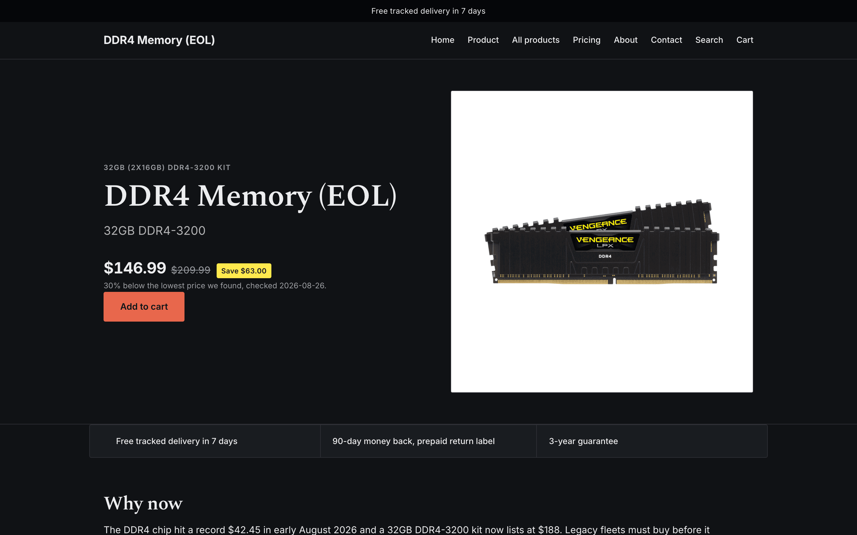
The product is a memory kit for machines that still run DDR4 — a part with a shrinking supply and a clear buyer. The page opens with one headline that says what the kit is and who it is for, then a price framed against the lowest listing the engine found, with the date it was checked. There is no menu of other products to wander into, because there are no other products.
Example 2 — a portable power station, light theme
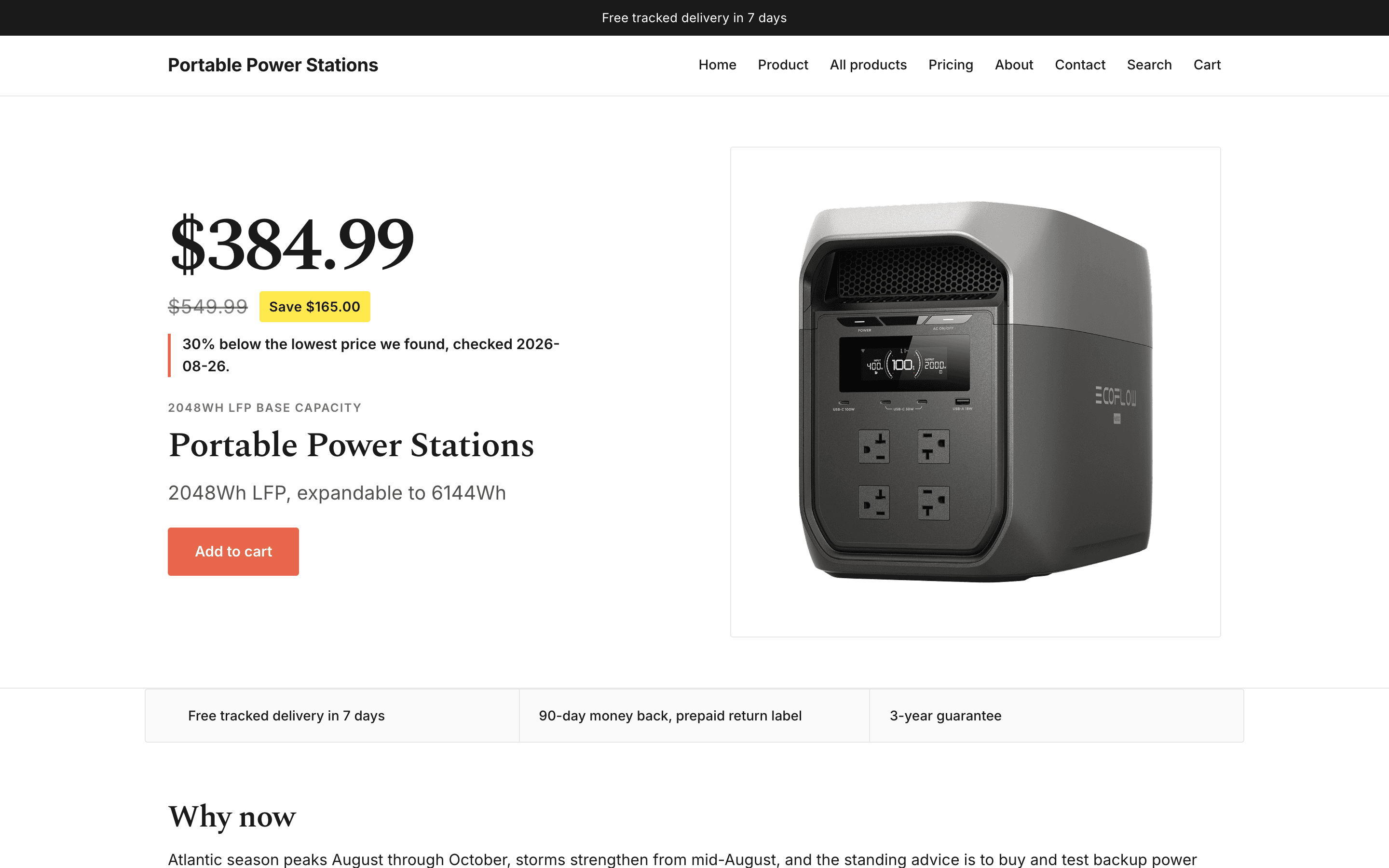
Same skeleton, opposite look. A power station is a situational product: the reason to buy is a dated event — an outage, a storm season, a heatwave — so the store leads with a "why now" section that quotes its sources with dates and links, rather than a generic discount banner.
What the two share — and what any single-product website needs
- One headline, one product. The visitor knows what is for sale before scrolling. Both stores put the product and its one-line promise above everything else.
- A dated reason to buy now. Not "limited time" — an actual event, quoted from a source, with the date. It ages visibly, which is the point: a visitor can check it.
- Specifications as a decision list. Only the numbers a buyer compares, not the whole spec sheet.
- A price anchored to a real listing. The comparison names the lowest listing found and when it was checked.
- One call to action. There is no second product to consider, so there is no second button.
- A FAQ that only promises what the owner declared. The generator refuses to invent a policy to make the FAQ look complete. A promise nobody made is a refund waiting to happen.
Mobile is the real store
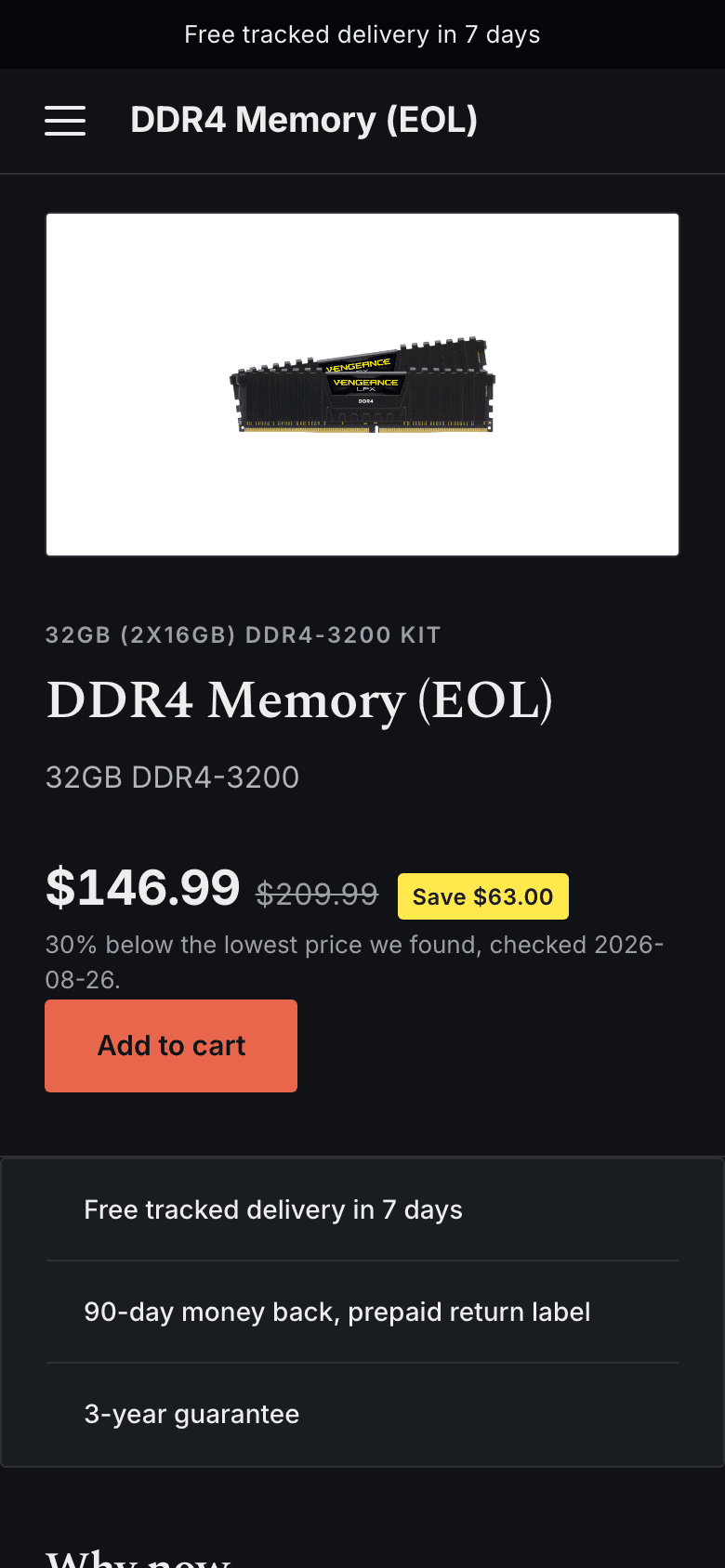
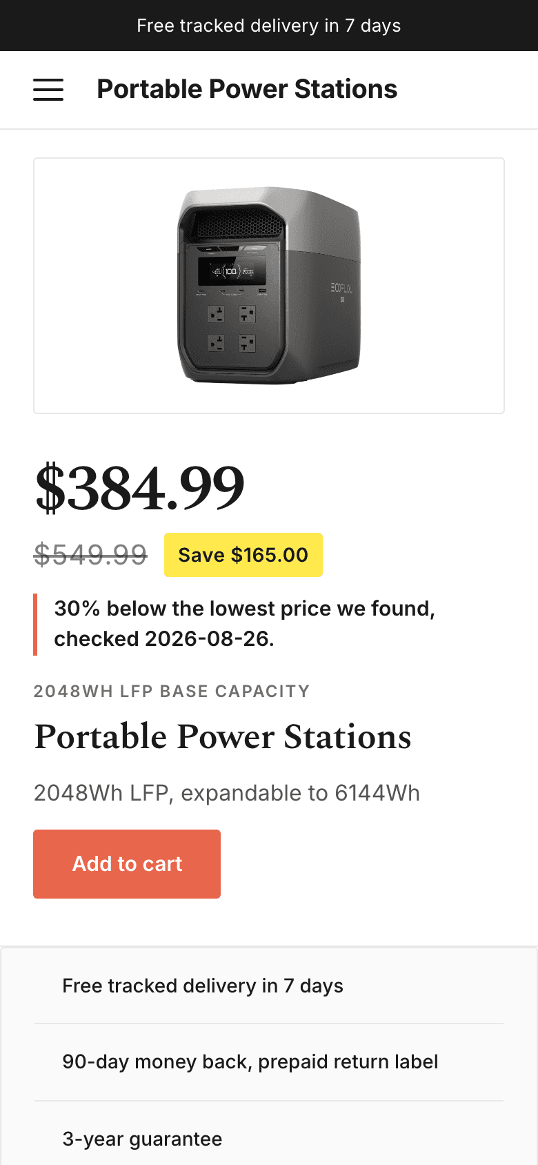
Most first visits from an ad happen on a phone. Both examples keep the same order on a 390-pixel screen: headline, price, reason, specifications, one button. A one-product store that only works on desktop only works for the people you are not paying to reach.
Why copying an example is the wrong lesson
The reason these examples work is not the layout. A shopper in 2026 has closed enough near-identical one-product stores to recognise a template on sight (see dropshipping in 2026). What transfers is the structure: one product, a dated reason, a checkable price, one button. The product itself has to be yours — which is why FlowFinds does not hand you the products in these screenshots. It finds one that no one else on the platform gets and builds the store around that. The theory is on the one-product store; the method is on how to find winning products.
Build yours
FlowFinds picks the product, writes the page, and funds the domain and the first $10 of ad spend. No card, no trial clock — see pricing. The walkthrough is six steps (your first store, under an hour), and the builder itself is described on the AI store builder.